Why Consistency Matters
Think about the last time you recognised a brand instantly from its colours, fonts, or logo — before even reading a word. That’s the power of visual consistency. When your audience sees a unified look and feel across platforms, it builds credibility, familiarity, and trust.
Inconsistency, on the other hand, confuses people and makes your brand feel unreliable.
Colours That Speak for You
Colours carry emotion and memory. When your social posts, website, and printed materials all use the same palette, customers build strong associations with your brand. Stray shades can dilute that recognition.
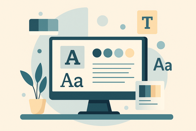
Fonts That Define Personality
Typography plays a big role in tone. A clean sans-serif conveys modernity and simplicity; a serif suggests tradition and reliability. Using consistent fonts ensures your brand personality comes through loud and clear.
Logos and Icons for Recognition
Your logo is your signature. Consistency in how it’s used (placement, size, and colour) avoids confusion and builds recognition across touchpoints. Supporting icons should also align in style and tone.
Templates for Consistency at Scale
One of the easiest ways to maintain a consistent look is through brand templates — pre-designed layouts for social media posts, presentations, or proposals. They save time and prevent design drift.
The Trust Dividend
When your visuals look professional and consistent, your brand feels reliable. Customers are more likely to trust you, buy from you, and recommend you to others.
How Creatipix Helps
At Creatipix, we design brand identity systems that lock in your colours, fonts, logos, and templates. We make sure that whether your customer sees you online, on paper, or at an event, they see one clear, consistent story.
Ready to build trust with your visuals?
Give us a call at 06 876 5575 to discuss creating a consistent, recognisable brand identity for your business or organisation.